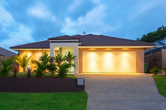
Once you’ve been living somewhere for a few years, and your house is all set up, there doesn’t seem to be much point to checking out display homes (first world problem right there).
If anything, seeing the latest in home design and decor tends to sow seeds of discontent, and feed our greed, rather than inspire.
Which is why it’s been several years since we last set foot in a display home. However as regular readers would know, we recently moved house and thought that display home interiors might be a good source of inspiration.
Trends in Display Home Interiors 2019
We’ve visited about two dozen display homes now at the Rochedale Display Village on Brisbane’s southside, and were inspired by the latest in luxury home design – plus it’s been an excellent way to absorb the latest trends.
- Neutrals Rule the Day
The newest neutrals are grey, black, white, and beige, combined with metal accessories – rose gold, copper, silver and stainless, brass.
By the fourth or fifth house I was gasping for colour, like a fish out of water (and not just because it’s my one little word for 2019!).
I felt like I was floundering in a sea of bland, despite the generous use of textures in an attempt to create interest and impact.
(To give you an idea, take a look at the image below. It’s a compilation of the brightest decor I could find – and yes, I am fully aware that one is an exterior shot, and in another, my shirt is all that is providing the colour!)
Which brings me to the next trend I noticed.
- Wallpaper
Wallpaper
- Silly Trends
The obsession with no toilet door, or clear glass in ensuites continues (here’s a blog I wrote about the stupidest bathroom I ever saw).
You’d think in this luxe ensuite below – which is larger than our master bedroom – that they would have been able to afford a door on the his’n’hers toilets situated behind the double shower. Seriously.
On the upside, just think – his’n’hers toilets would put an end to any arguments over the toilet seat being left up, and could even save marriages!
In most cases, the glass doors now tended to be frosted – but you’ll find them on family and guest bathrooms and not just ensuites. If you happen to be passing by, they really don’t leave much to the imagination …
- Built In Entertainment Units
Many of the display home interiors we saw, placed the television on a wall which featured a low line, built in entertainment unit
Past their Use By Date?
I also took note of what design ideas seem to be on their way out. These included:
- Display Home Theatre Rooms. Only a couple of the houses we visited still included a dedicated home theatre room. Personally I’m glad, I think that like formal dining rooms, media rooms are a bit of a waste of space. (The boys in my family disagree, which is why we had one in our last home).
- Brown. While you will still see a variety of browns, particularly chocolate and mocha, you will find more than 50 shades of grey everywhere you look (sorry couldn’t resist the pop culture reference).
So what exactly did the husbear and I gain from our study of the various display home interiors?
Ideas We Loved
We gleaned a few ideas that we are thinking about using in our new home:
(Clockwise from top left)
- Windows above the kitchen cupboards.
- We thought about installing a bar fridge
- Definitely want a round mirror
- Very keen for a built in entertainment unit downstairs, and perhaps papering that wall too.
- We have a couple of cut outs in the living area walls, and are thinking of installing decorative screens
And finally, THIS picture above is how I want to set up my study. (Yes, I know I bought some cheap office furniture
What are your favourite new trends when it comes to home interiors? Or is there a style or feature that I haven’t picked up on?
